
Date Widget
Definition
There are two Widgets allowing to configure the display /edit dates (date, date & time) attribute.
Date Edit | Date Display |
|---|---|
 |  |
Configuration
Properties
Properties name | Type | Mandatory | Description | Values (default value in bold) | Edit | Display |
|---|---|---|---|---|---|---|
required |
| NO | Defines if the attribute is mandatory or not. | true, false |
|
|
dateFormat |
| NO | The date format to be used when displaying. | HOURS_MINUTES, HOURS_MINUTES_SECONDS, DAY_MONTH_YEAR_SHORT, DAY_MONTH_YEAR_LONG, DAY_MONTH_YEAR_HOURS_MINUTES_LONG,DAY_MONTH_YEAR_HOURS_MINUTES_FULL |
|
|
offset |
| NO | A valid ISO 8601 period duration (ex "P1D") to shift the date selection on the frontend. For the edit widget, it applies only for DATETIME attribute when the property "dateOnly" is true, and shifts the date forward. For the display widget, it applies if configured, and shifts the date backward when displayed in the frontend. The rationale of this offset is better explained with an example: For the attribute "enabledUntil", if dateOnly is true, a datetime at AM midnight is selected. One might want to indicate that the selected day must also be included as the end of the enabled period and want to shift the datetime by one day. This is done by setting the offset at "P1D". For coherence, the associated display widget should also have the same offset. Note that if the edit widget is meant to pick a datetime as "dateOnly" with an offset, one should configure the "dateFormat" of the display widget to display as a date (such as DAY_MONTH_YEAR_LONG) as well, thus without hours; otherwise the display will be confusing if shown in another timezone than UTC. | A valid PeriodDuration, null |
|
|
timeZoneStrategy |
| NO | SETTING: the timezone used on the frontend for picking/displaying a datetime is defined by the setting ui.usr.timeZone. BROWSER: the timezone used by the frontend for picking/displaying a datetime is defined by the user's browser local timezone. | SETTING, BROWSER |
|
|
showTooltip |
| NO | Allows to display or not (when hovering over a date attribute) a date time | true, false |
|
|
backgroundColor |
| NO | Defines the background color. | #ffffff, standard CSS color value |
|
|
bold |
| NO | Defines if the value is displayed in bold or not. | true, false |
|
|
fontSize |
| NO | Defines the displayed size. | INHERIT, XX_SMALL, X_SMALL, SMALL, MEDIUM, LARGE, X_LARGE, XX_LARGE |
|
|
italic |
| NO | Defines if the value is displayed in italic or not. | true, false |
|
|
textAlign |
| NO | Defines the text alignment. | LEFT, CENTER, RIGHT |
|
|
textColor |
| NO | Defines the displayed text color. | #000000, standard CSS color value |
|
|
underline |
| NO | Defines if the value is underlined or not. | true, false |
|
|
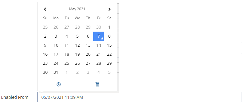
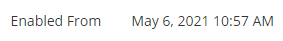
Example
Date Edit | Date Display |
|---|---|
XML
|
XML
|
Read Next
- Features
Design screens and business features to manage objects.