
Standalone Text Widget
Definition
The Standalone Text Display Widget allows to configure the display of text which is not linked to an attribute.
Configuration
Properties
Property name | Type | Mandatory | Description | Values (default value in bold) |
|---|---|---|---|---|
backgroundColor |
| NO | Defines the displayed background color. | #ffffff, standard CSS color value |
bold |
| NO | Defines if the value is displayed in bold or not. | true, false |
fontSize |
| NO | Defines the displayed size. | INHERIT, XX_SMALL, X_SMALL, SMALL, MEDIUM, LARGE, X_LARGE, XX_LARGE |
italic |
| NO | Defines if the value is displayed in italic or not. | true, false |
textAlign |
| NO | Defines the text alignment. | LEFT, CENTER, RIGHT |
textColor |
| NO | Defines the displayed text color. | #000000, standard CSS color value |
underline |
| NO | Defines if the value is underlined or not. | true, false |
text |
| YES | Defines the text to display with an i18n key. | ui.features.widgets."id of the widget".title |
Example
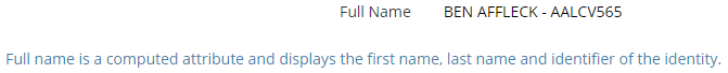
<widget id="fullName_info" xsi:type="ctdbum:StandaloneTextDisplayWidgetType">
	<hidden>false</hidden>
	<config>
		<backgroundColor>#ffffff</backgroundColor>
		<bold>false</bold>
		<fontSize>INHERIT</fontSize>
		<italic>false</italic>
		<textAlign>LEFT</textAlign>
		<textColor>#397fae</textColor>
		<underline>false</underline>
		<text>ui.features.widgets.fullName_info.title</text>
	</config>
</widget>
Read Next
- Features
Design screens and business features to manage objects.