
Text Widget
Definition
There are several types of Widgets allowing to configure the display /edit of attributes with a string type.
Text Input Edit
Text Area Edit
Text Display
Text Input Edit | Text Area Edit | Text Display |
|---|---|---|
 |  |  |
Configuration
Properties
Property name | Type | Mandatory | Description | Values (default value in bold) | Input Edit | Area Edit | Display |
|---|---|---|---|---|---|---|---|
type |
| NO | Defines the type of the input (example: obfuscated for password). | text, password |
|
|
|
width |
| NO | Defines the width of the text area. | SMALL, MEDIUM, LARGE, AUTO |
|
|
|
height |
| NO | Defines the height of the text area. | 5 |
|
|
|
required |
| NO | Defines if the attribute is mandatory or not. | true, false |
|
|
|
placeholder |
| NO | Defines the message that will be displayed in the field of the attribute. | - |
|
|
|
backgroundColor |
| NO | Defines the background color. | #ffffff, standard CSS color value |
|
|
|
bold |
| NO | Defines if the value is displayed in bold or not. | true, false |
|
|
|
fontSize |
| NO | Defines the displayed size. | INHERIT, XX_SMALL, X_SMALL, SMALL, MEDIUM, LARGE, X_LARGE, XX_LARGE |
|
|
|
italic |
| NO | Defines if the value is displayed in italic or not. | true, false |
|
|
|
textAlign |
| NO | Defines the text alignment. | LEFT, CENTER, RIGHT |
|
|
|
textColor |
| NO | Defines the displayed text color. | #000000, standard CSS color value |
|
|
|
underline |
| NO | Defines if the value is underlined or not. | true, false |
|
|
|
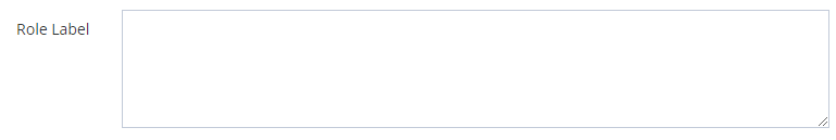
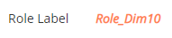
Example
Text Input Edit | Text Area Edit | Text Display |
|---|---|---|
| | |
XML
|
XML
|
XML
|
Read Next
- Features
Design screens and business features to manage objects.