
Frame
Definition
The frame property allows to define an optional “frame” around the Screen or the Section.
Frame inside Screen | Frame inside Sections |
|---|---|
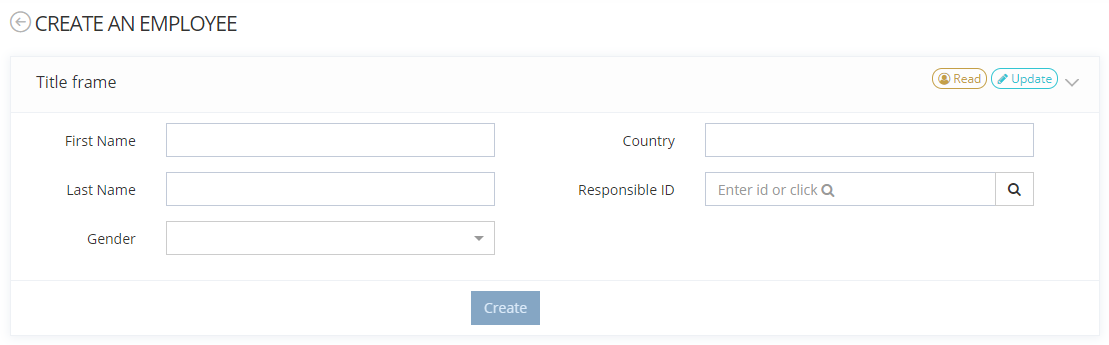 | 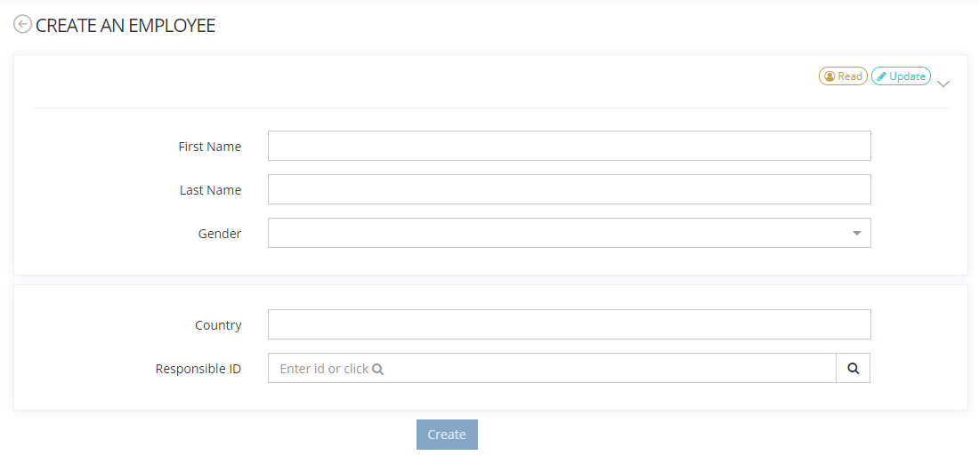 |
Configuration
Properties
Property name | Type | Mandatory | Description | Values (default value in bold) |
|---|---|---|---|---|
actions | - | NO | Allows to configure one or several actions (like Button Widget or Groovy action rule for example) that will be displayed in the header. If no action is configured, the header will be displayed even if the title property is set to false. | - |
collapsible |
| NO | Allows to define if the frame is collapsible or not. If the property is set to true, the frame will be folded by clicking on an arrow on the far right of the header. | true, false |
display |
| NO | PORTLET, NONE | |
initiallyCollapsed |
| NO | Allows to define if the frame will be closed or not when the feature opens. It can be expanded manually. | true, false |
title |
| NO | Allows to define if a title is displayed on the header. If the display property is set to NONE, a title cannot be displayed. Titles are defined in the following i18n keys:
| true, false |
The accumulation is not necessarily recommended from an aesthetic point of view.
Example
Frame inside Screen | Frame inside Sections |
|---|---|
CODE
|
CODE
|
Read next
- Widgets
Widgets are used (and mandatory) in the configuration of Features to display/edit information about Attributes or manage Memority Portal functionalities.