
Icon
Usage
Icons display can be customized in several places to fit the purpose of action buttons or titles.
These icons comes from the Font Awesome 6 (Free plan) library.
In order to use the icons:
Search the wanted icon on the Font Awesome website (the “Free” filter should be used)
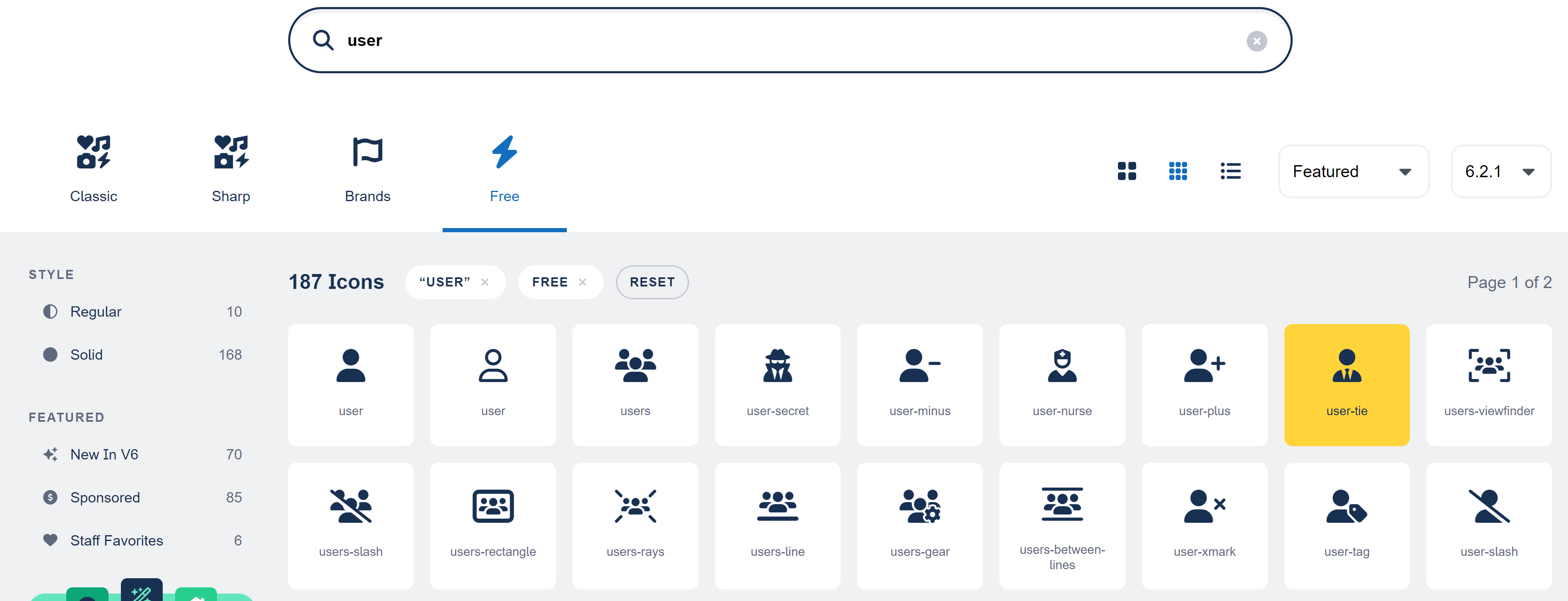
2. Click the icon
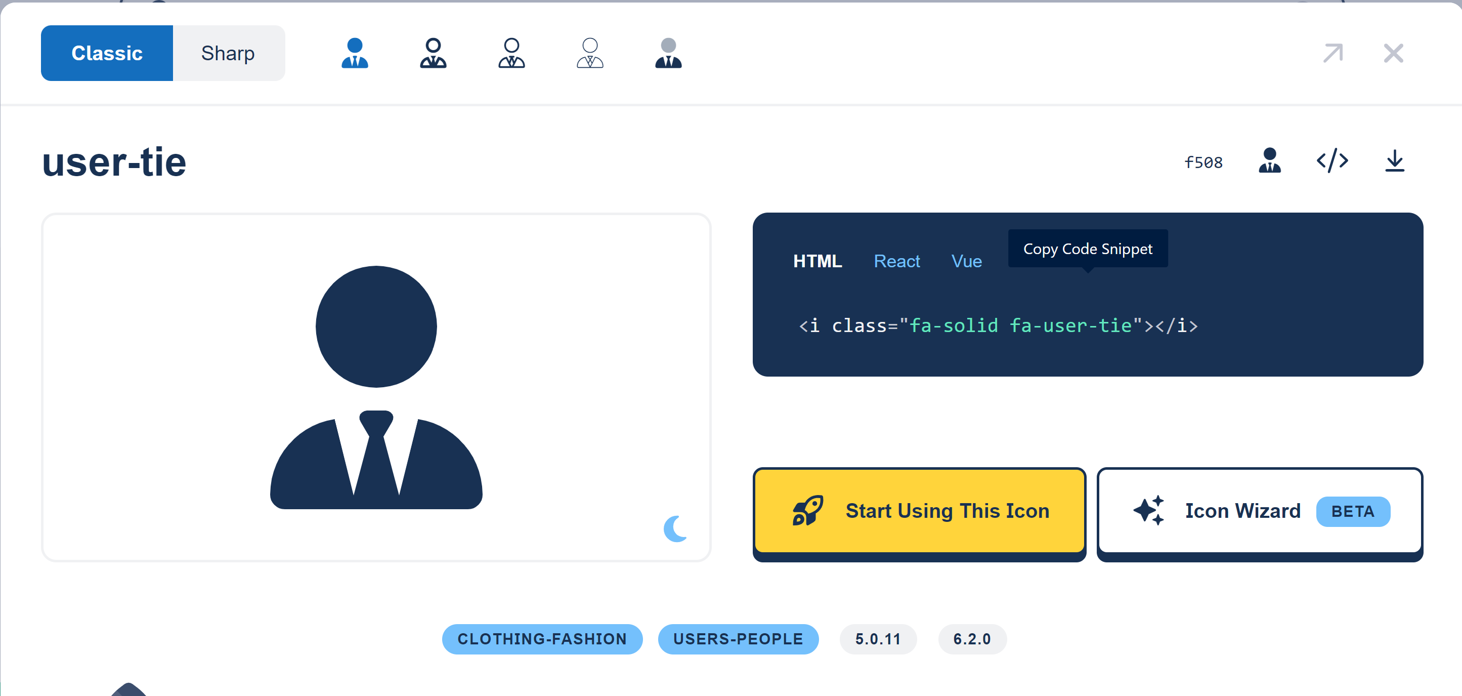
3. Ensure that you are using the “Classic” and “Solid” style
4. Copy the CSS selector (in this example “fa-solid fa-user-tie”)
5. This value is the one you should provide in the configuration element requiring an icon.
Example for an action button:
XML
<screen>
	<views>
		<view>
			<sections>
				<section id="test-section-1">
					<layout>SINGLE</layout>
					<frame>
						<actions>
							<action id="user-tie-action" xsi:type="ctdbum:ButtonWidgetType">
								<align>RIGHT</align>
                                <borderless>false</borderless>
                                <circle>true</circle>
                                <color>default</color>
                                <icon>fa-solid fa-user-tie</icon><!-- Configure the icon to display (user with a tie) -->
                                <label>true</label>
                                <link>feature://test_feature/{routeObjectId}</link>
                                <linkTarget>SELF</linkTarget>
                                <outline>false</outline>
                                <size>SM</size>
                           </action>
						</actions>
						<collapsible>true</collapsible>
						<display>PORTLET</display>
						<initiallyCollapsed>false</initiallyCollapsed>
						<title>true</title>
					</frame>
					<columns></columns>
				</section>
			</sections>
		</view>
	</views>
</screen>