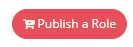
Button Widget
Definition
The Button Widget allows to display a button on a feature, allowing to redirect the user to another feature.
Configuration
Properties
Properties name | Type | Mandatory | Description | Values |
|---|---|---|---|---|
| NO | This property is mainly used when displaying a button in a search function to limit the display of the button according to the type of object. For example, you could have a dedicated button for each type of object that links to a function dedicated to that type. An example is available in the Example section. | - | |
align |
| NO | Used to define the display area of the Widget. | LEFT, RIGHT |
authenticationLevelSufficient |
| NO | Used to define if the feature is "sensitive" or not. If true, to access the Feature, the user will have to upgrade its authentication level (see settings BUM). | true, false |
borderless |
| NO | Used to define if the label of the Widget is underlined or not (when the cursor goes over the text). | true, false |
circle |
| NO | Used to define if the border of the Widget is circled or not. If false, the border of the Widget is square-shaped. | true, false |
color |
| NO If no color is defined, borderless and circle properties have no effect. | Used to define the color of the label, border and highlight of the Widget. | For available colors, see Metronic Color Library |
featureToExecute |
| NO | Used to define the redirection of the user to an immediate execution feature. You cannot use both <target> and <featureToExecute> tags in the same Widget configuration. You need to configure special i18n keys in order to display the pop-up correctly. | id of the feature |
icon |
| NO | Used to define if an icon is displayed inside the button. | For available icons, see https://fontawesome.com/v4.7.0/icons/ fa fa-"name of the icon" |
label |
| NO | Used to define if the label of the Widget is displayed inside the button or not. The label will have to be translated by a I18N key: "ui.features."id of the feature".views."id of the view".sections."id of the section".widgets."id of the action".label | true, false |
target |
| NO If no target is defined, the button will have no action. | Used to define the redirection of the user to another feature. This is a polymorphic property that can be of three different types: ButtonLinkTargetAllows to configure a link that will open in the current tab or a new tab. The “target” property can take two values: SELF = open link in same tab NEW_TAB = open link in a new tab
XML
ModalWidgetTargetOpen a Widget in a modal dialog (for such an action as: reset a password, role dashboard, ...). The size of the dialog can be controlled by defining a display option on the widget (modalSize : XS ,SM,LG)
XML
ModalTargetAllows to configure a link that will open in a modal dialog. It is similar to the widgetToOpen case but the modal is fully routable using the (secondary:…) url pattern. The “onDismiss” property control the behaviour of the primary route (the one behind the modal) after the modal is dismissed. NONE = Do nothing REFRESH = Refresh the primary route
XML
| For a link to a feature: feature://<featureId>/{dataKey.id} For a hub Feature: feature://user-hub.user-card-read/{dataKey.id} For a link to a user task: task://<action>/<id>
|
outline |
| NO | Used to define how to display the configured color. | true (background is white and text is the configured color), false (background is the configured color and text is white) |
size |
| NO | Used to define the size of the button. | XS, SM, LG |
objectTypes properties
Property name | Type | Mandatory | Description | Values (default value in bold) |
|---|---|---|---|---|
objectType |
| NO | The object type for which the button is available | - |
Example
Code |
|---|
Link configuration
XML
|
Widget To Open configuration
XML
|
Modal Link configuration
XML
|
Restriction depending on objectType (in a Reporting List Widget for example)
XML
|