
Hub
Definition
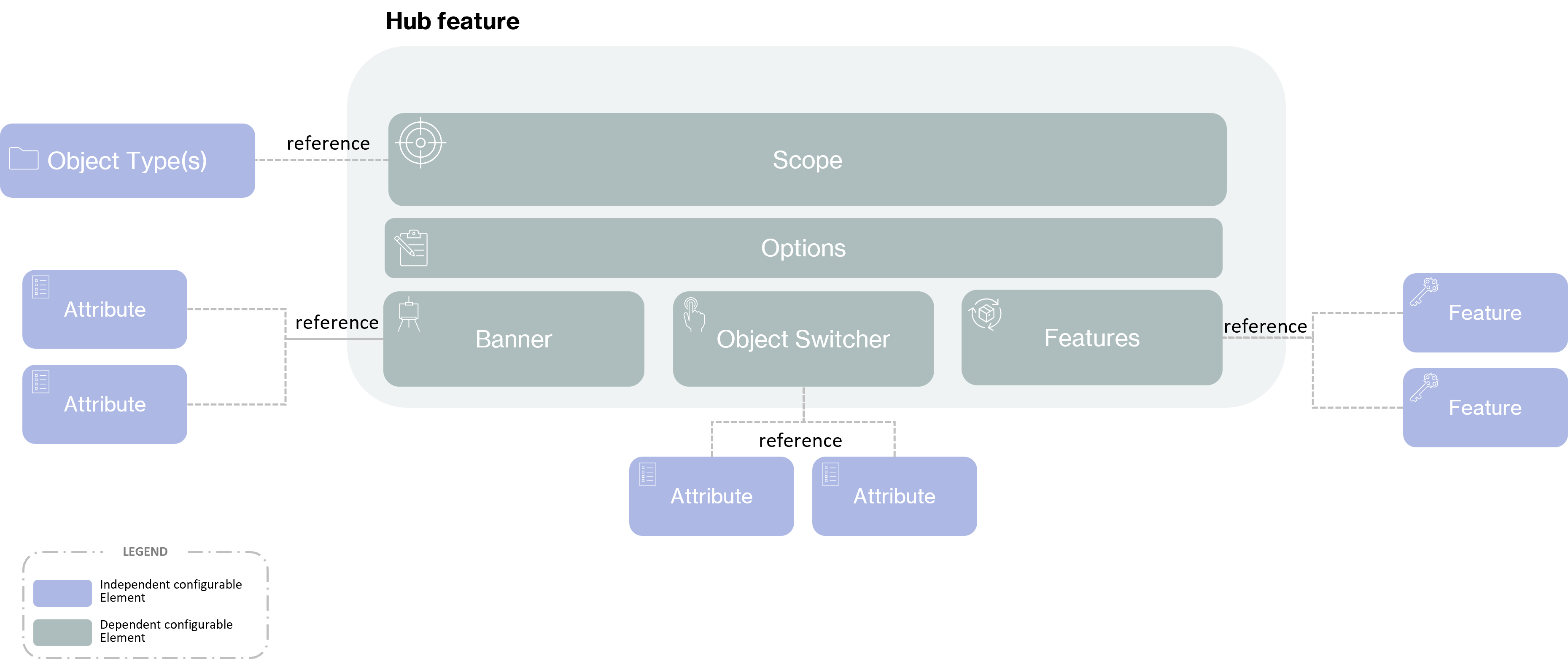
A hub Feature is used to list several Features on tabs on the same screen.
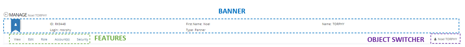
A hub Feature is split into two parts:
Upper part: a banner with the display of different informations (keys and picture).
Tabs part: a hub with links to other Features and an Object switcher (optional).
A hub Feature is only accessible through another Feature by using an action button.
Usage
In a hub Feature, depending on the Scope configuration, the user can only see tabs for which the Scope matches. If the managed user doesn't match the Scope then the tab is hidden.
Steps | Preview | |
|---|---|---|
| 1 | Display a feature within a hub, the hub banner and feature screen are displayed. | 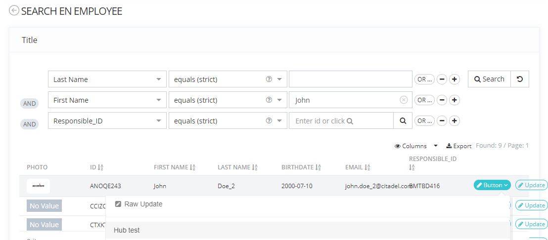 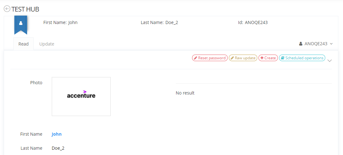 |
| 2 | Click on a tab. to display other Feature within the same hub. | 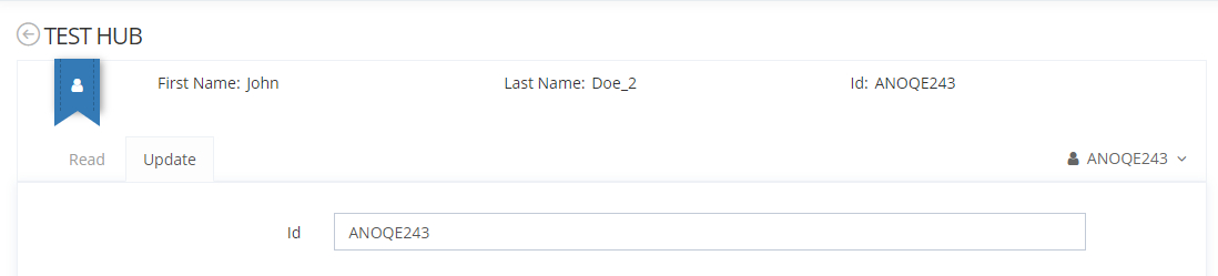 |
Configuration
Prerequisite
The following prerequisite are mandatory before configuring a hub Feature:
Have configured an object type (Identity, Organization, Resource, Role or Role Publication).
All attributes definition and features listed in the hub Feature must be created and linked to the object type.
Properties
Mandatory configuration elements
Global configuration elements are detailed on the Feature page.
Configuring a hub is also mandatory in a hub feature if not, the Feature will not be usable.
Properties name | Type | Mandatory | Description |
|---|---|---|---|
hub | - | YES | First configuration level. |
hub properties
Properties name | Type | Mandatory | Description |
|---|---|---|---|
banner | - | YES | Allows to configure the banner of a hub Feature. |
features | - | YES | Used to list features that will be displayed on tabs. |
objectSwitcher |
| NO | Allows to display Attributes that describe a sibling Object. You can click on Object switcher to display the id of the sibling. |
banner properties
Properties name | Type | Mandatory | Description |
|---|---|---|---|
keys | - | YES | Used to list attributes to display in the banner. |
picture |
| NO | Allows to display a picture in the banner. If no picture is specified then a blue ribbon will be displayed instead. |
keys properties
Properties name | Type | Mandatory | Description |
|---|---|---|---|
key |
| YES | Used to indicate the id of the attribute. The Attributes will be displayed following in order of keys. To optimize display, choose key with short value. Do not configured too many keys; otherwise, the banner will be unreadable. There is no possibility to configure key locations. |
features properties
Properties name | Type | Mandatory | Description |
|---|---|---|---|
feature |
| YES | Used to indicate the id of the features. Tabs with each Features should be translated by the following key: ui.features."hub id".feature."feature id".tab |
objectSwitcher properties
Properties name | Type | Mandatory | Description |
|---|---|---|---|
displayedAttributes | - | YES if objectSwitcher is configured | Used to list attributes to display. |
displayedAttributes properties
Properties name | Type | Mandatory | Description |
|---|---|---|---|
attribute |
| YES if displayedAttributes is configured | Used to indicate the id of the attribute. |
Recommended configuration elements
The following requirements are recommended to build the configuration XML:
Authentication: define the authentication level to access Features.
OperationOnSelf: define if the Feature is used for a "self" usage.
HomeTile: use to access a Feature from the home page.